The chroma of a colour is the intensity.
High intensity of colour has a high fluorescence (fluro).

High chroma is 'fluro' or high fluorescence, or high saturation of colour.
Low chroma is 'washed out', or a low satur4ation of colour.

The chroma of a colour is the intensity.
High intensity of colour has a high fluorescence (fluro).
Low intensity is the opposite (washed out)
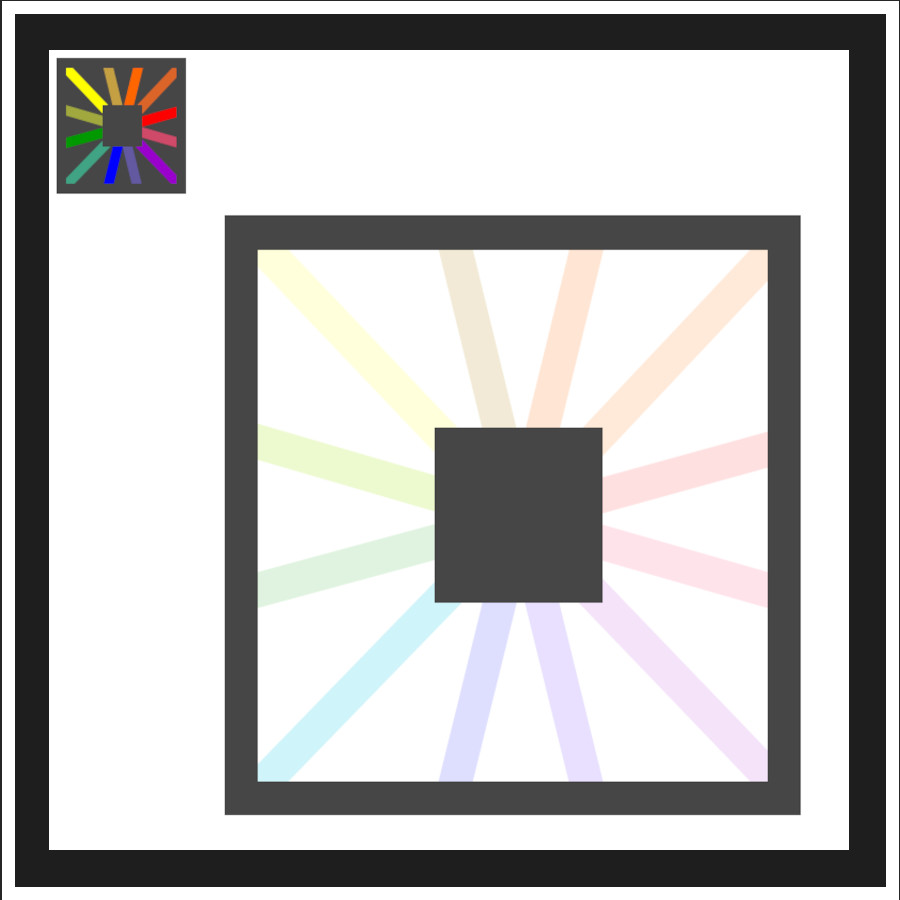
LOW CHROMA LOOKS 'WASHED OUT"
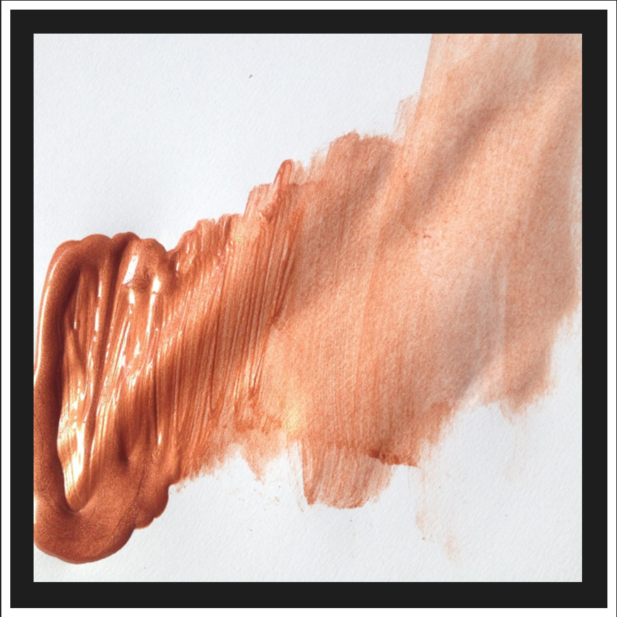
Thick paint will be a high chroma. Watered down there is a low intensity.
Meet Chromy Chroma - he helps explore all about chroma!
He is high!
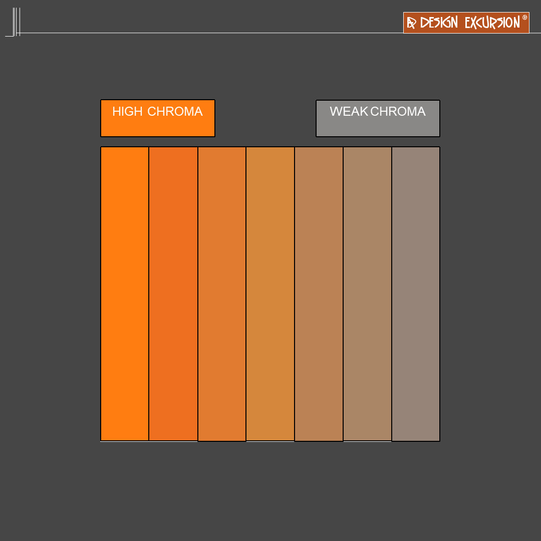
Another way to think of the saturation of the colour is how much light is reflected from a surface. If you shine an orange light on a white wall it will be a strong fluro colour. But if it were to go through a window, or lamp it would create a weak colour, and the colour would be absorbed.
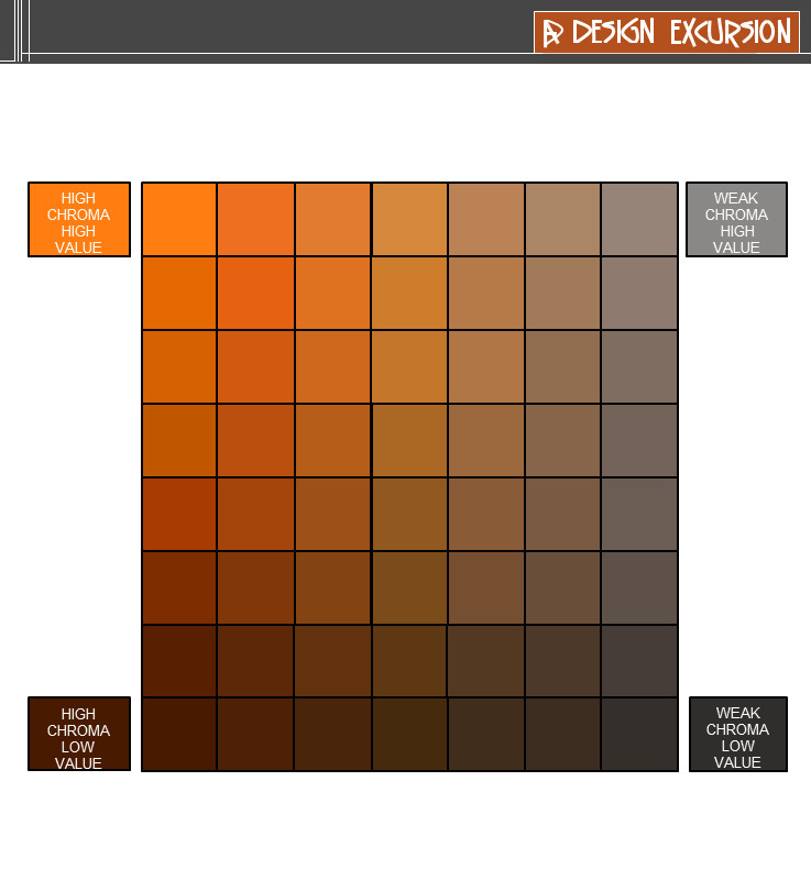
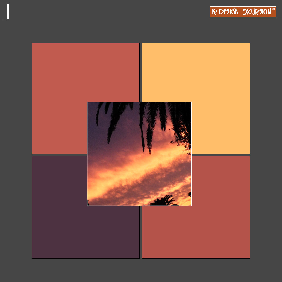
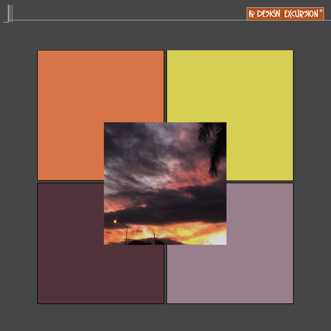
The table above shows the gradation of high to weak chroma
(Intensity of colour)
And the gradation of high to low value
(The amount of light on an object - sunny to shade ).
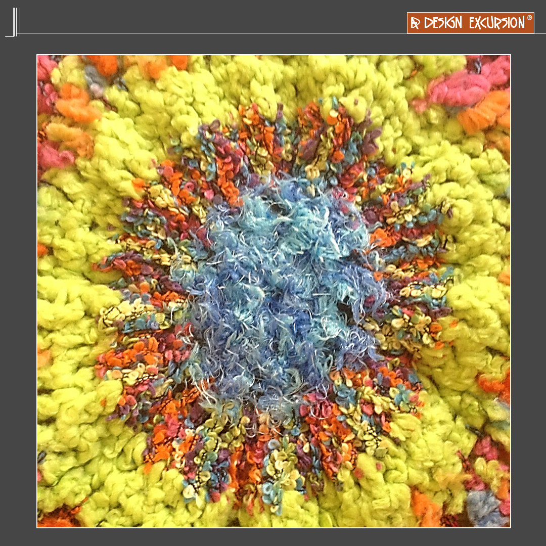
When chemicals were used after the industrial revolution there was an ability to suddenly create more high chroma colours. In the past these colours were very expensive as they used a high concentration of things from nature.
Textiles were able to be really bright. Ironically pure white fibres could now be seen. Have you ever seen a really white wool?

If you were to push a soft coloured pencil really softly on the paper you obtain a low chroma - there is a low saturation of colour. Using water colours - with a lot of water will achieve a low chroma.
Textas, and crayons often have high chroma colours, because of the chemicals used.
Use textas or crayons with chemicals creating fluro intensity or pushing a soft coloured pencil really hard on the paper will create a greater saturation of colour
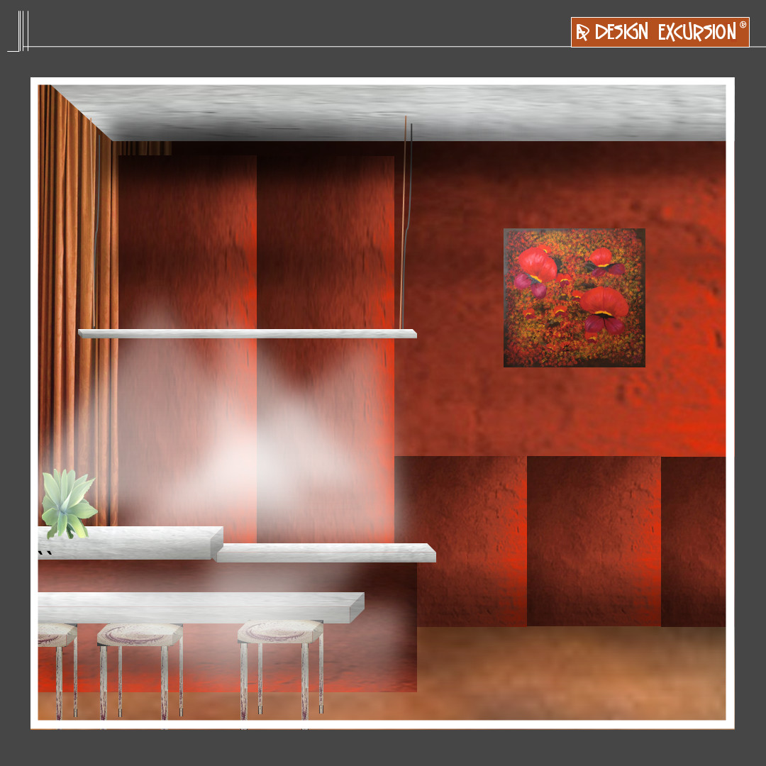
When white light is reflected from a surface the saturation becomes less. The high chroma red cupboard doors become less saturated under the bright light
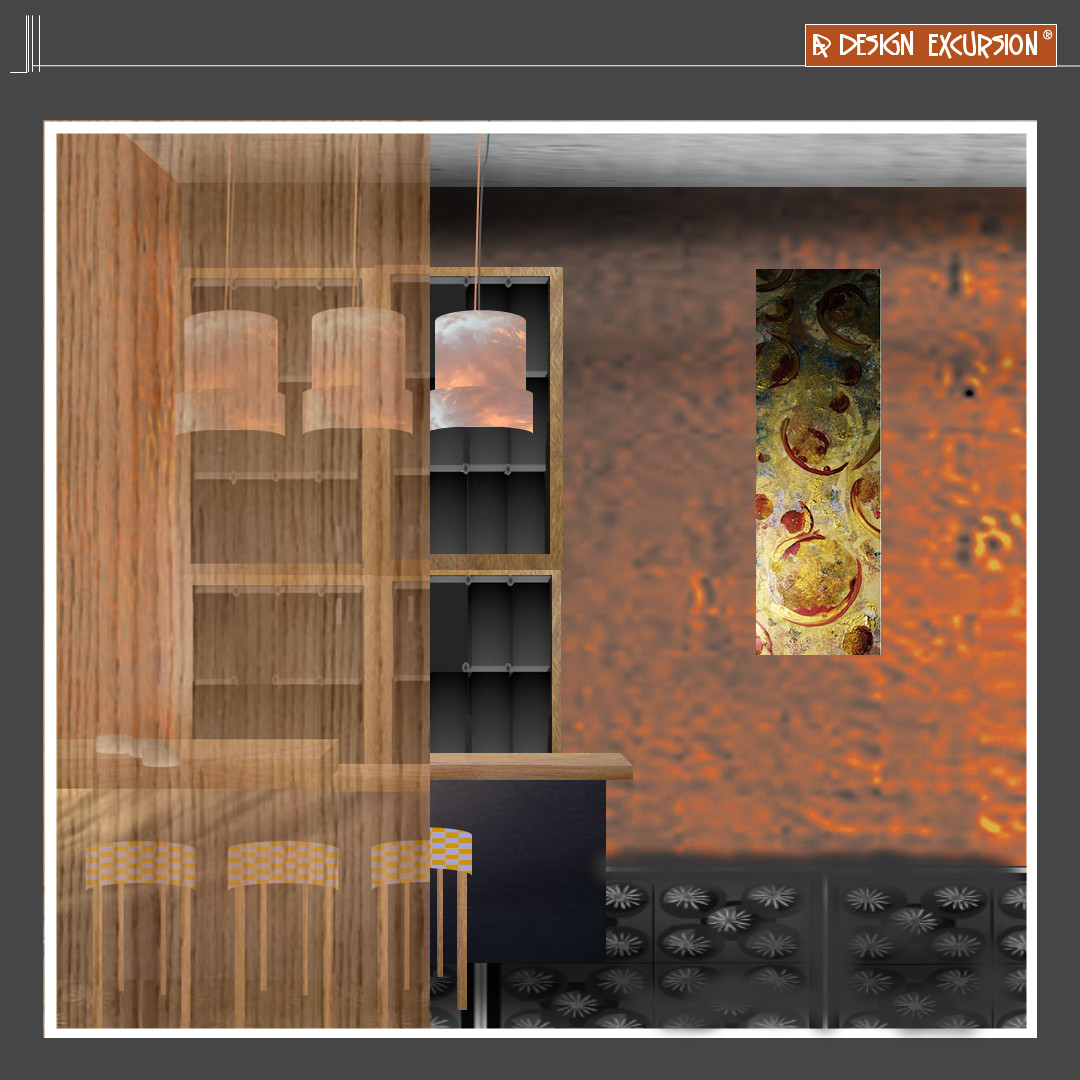
coloured glass will be seen to have less saturation than solid items. Just like a water colour.

When you look at high chroma colours through glass, they seem to have a lower chroma. The floor through the glass table looks less saturated as the glass reflects some of the light.
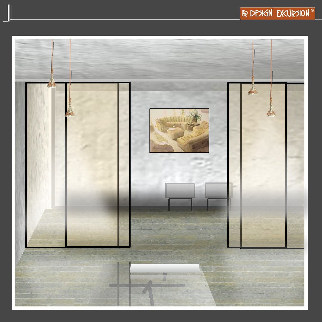
When the room is white, and pale yellow glass is used as the divider sliding doors, the saturation of colour is evident.
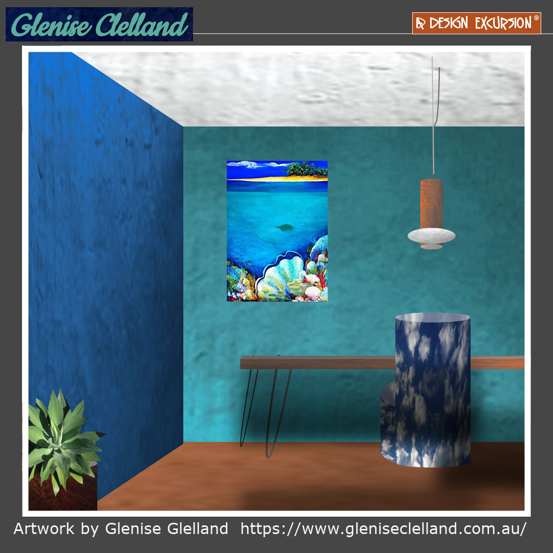
High chroma colours can be colour blocked on walls to create impact!
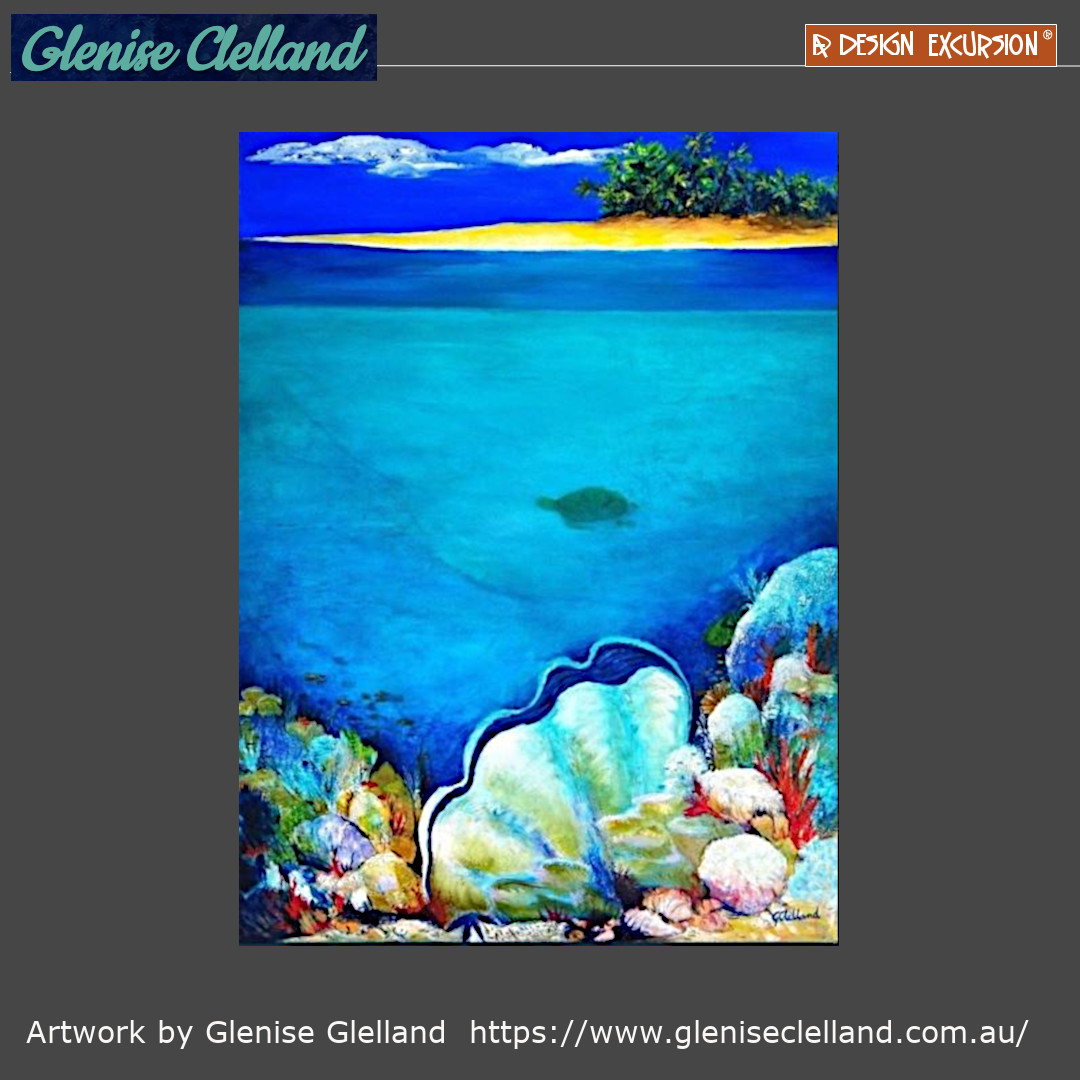
Glenise has used high Chroma colours in this piece which depicts the bight light of the tropical ocean.
See more about Glenise by clicking on her images.
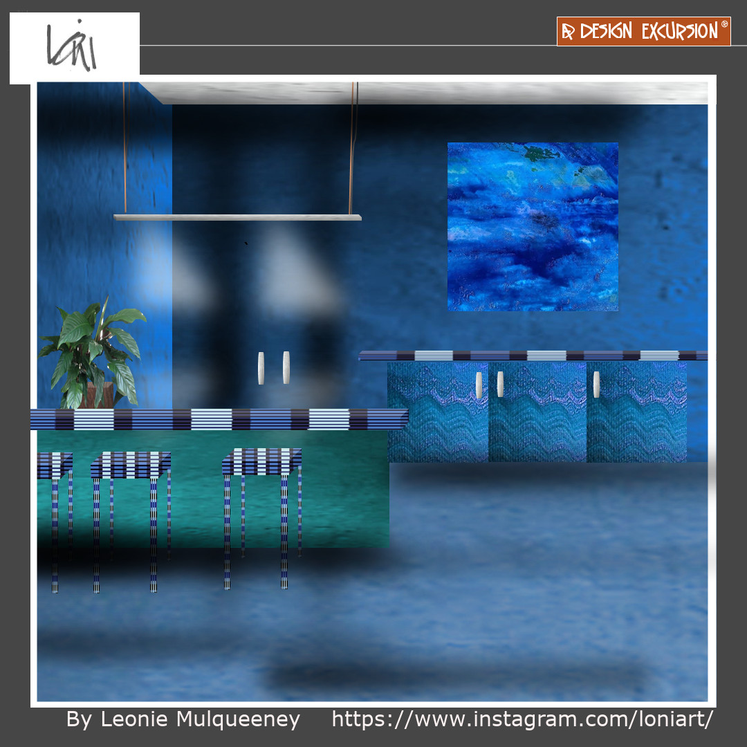
High Chroma colours work well in spaces that you don't spend a lot of relaxing time such as retail outlets and corridors. There is energy!
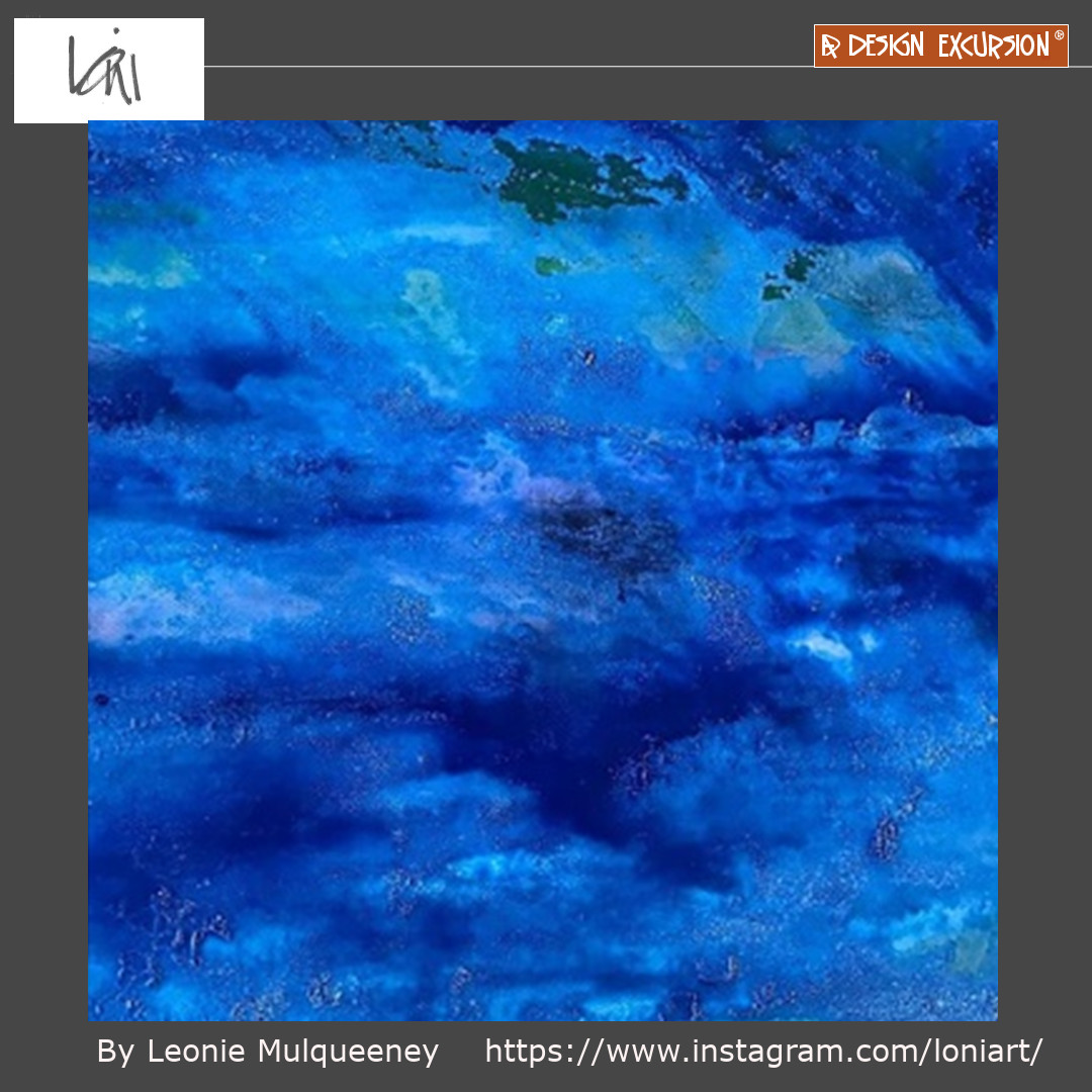
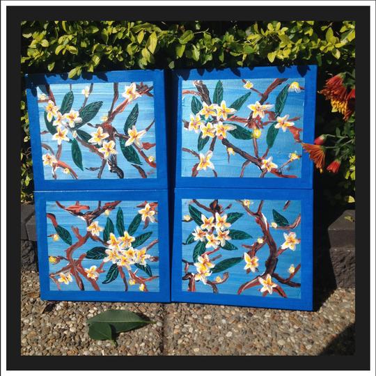
Leonie has used high intensity blues in this piece, creating energy.
See more about Leonie by clicking on her images.
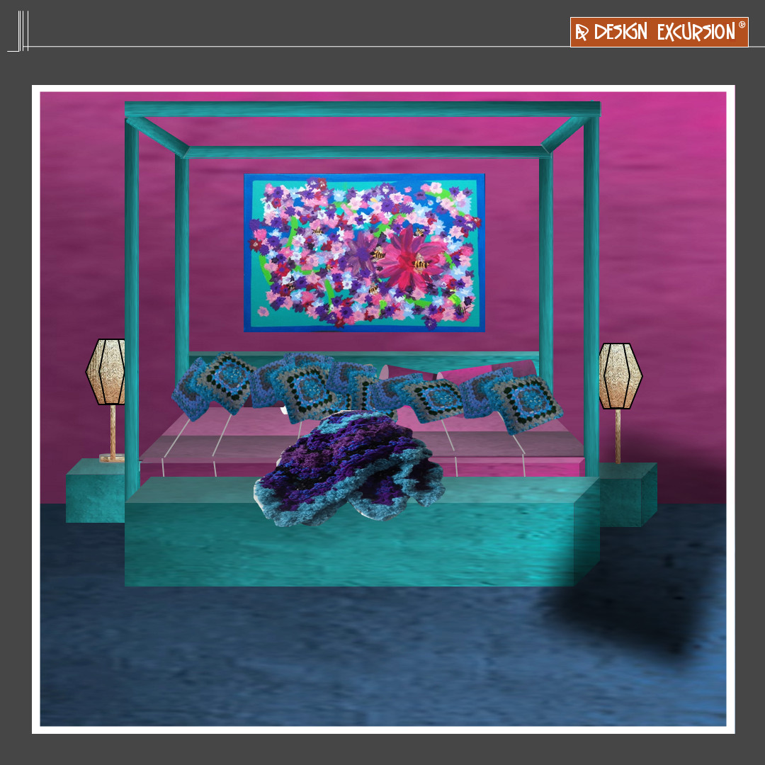
We have used high chroma colours in this sleeping space which creates energy to wake to when the light reflects!
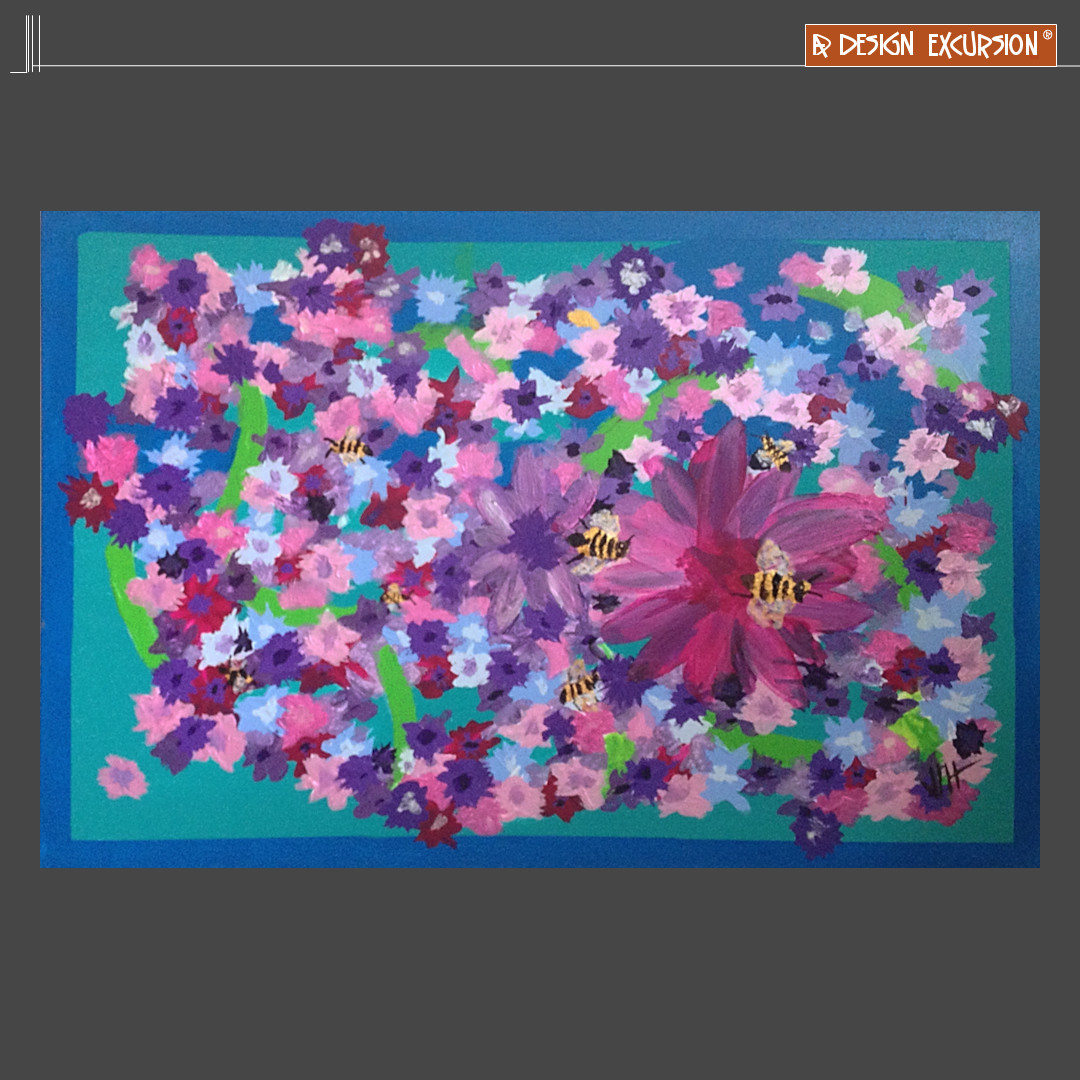
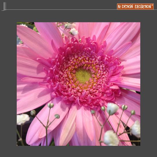
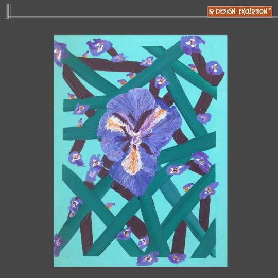
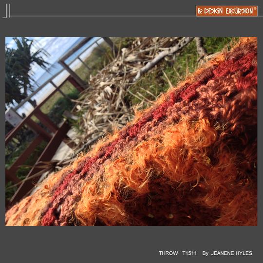
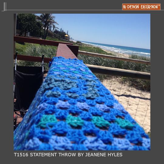
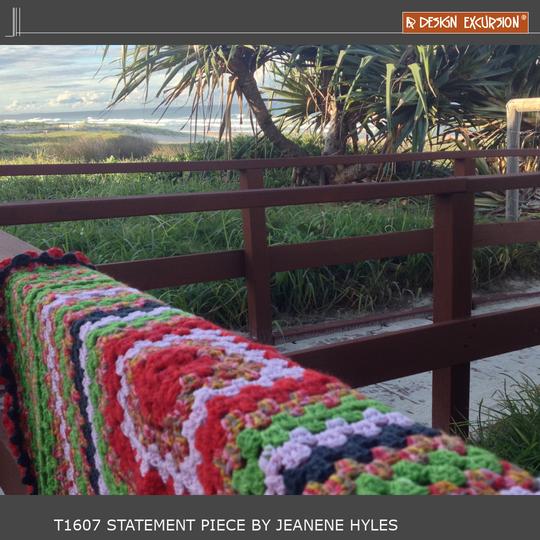
Jeanene has looked to natures high intensity colour.
See more about Jeanene by clicking on her images.
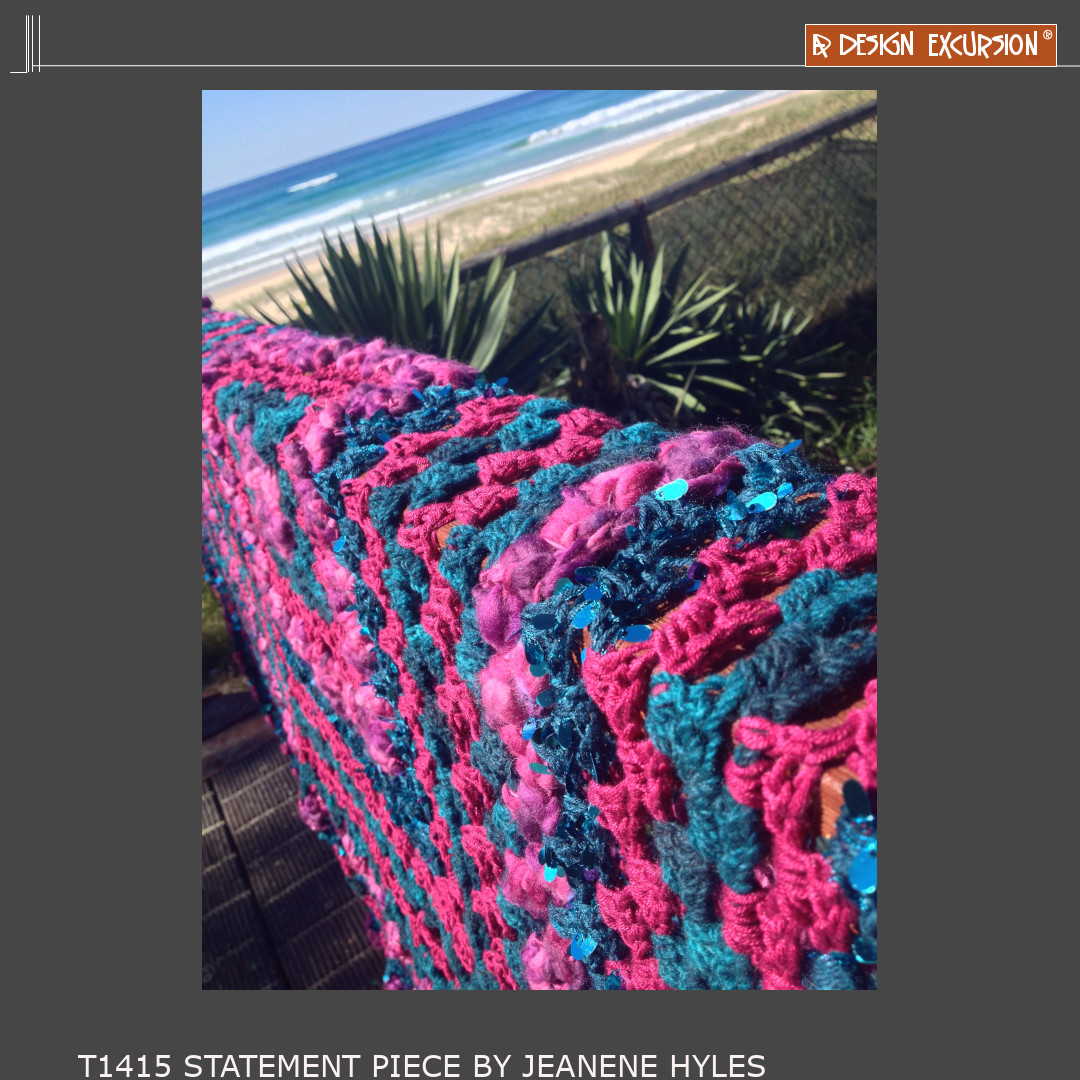
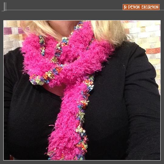
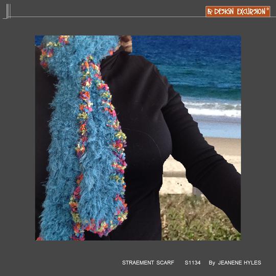
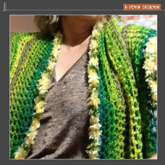
High Chroma colours create instant energy when used as decor pieces
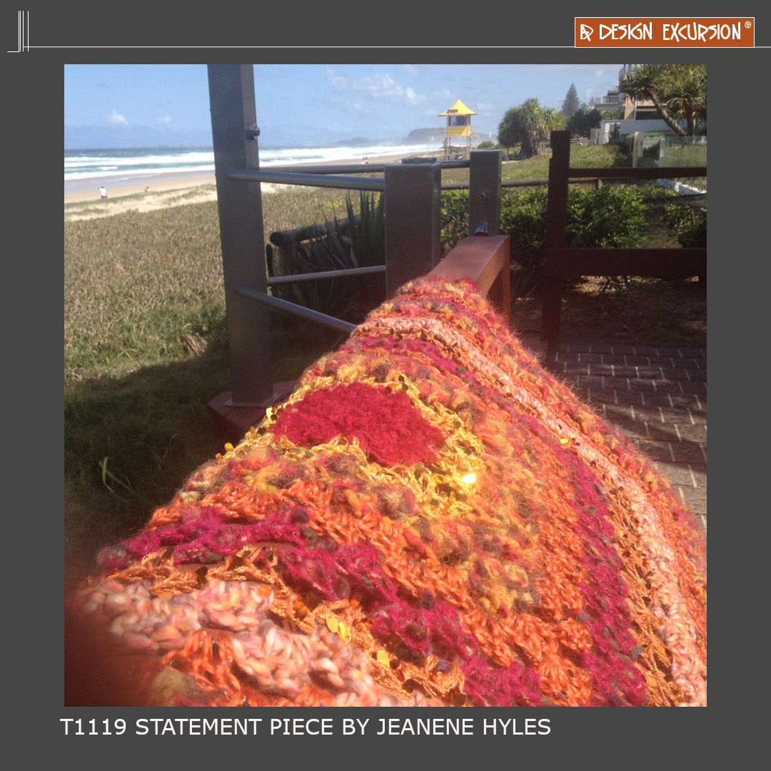
Under bright lighting high chroma colours pop!

