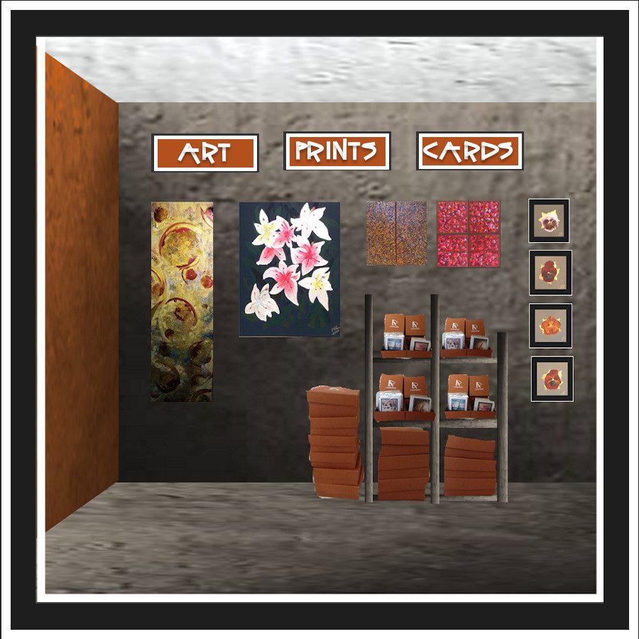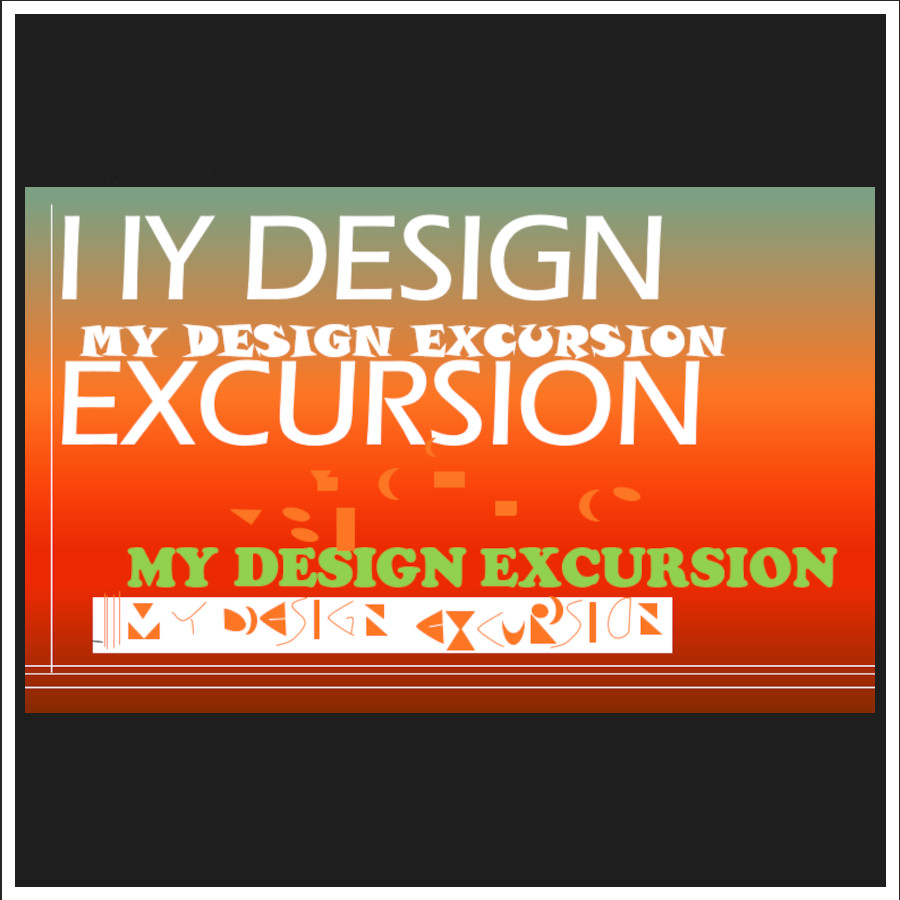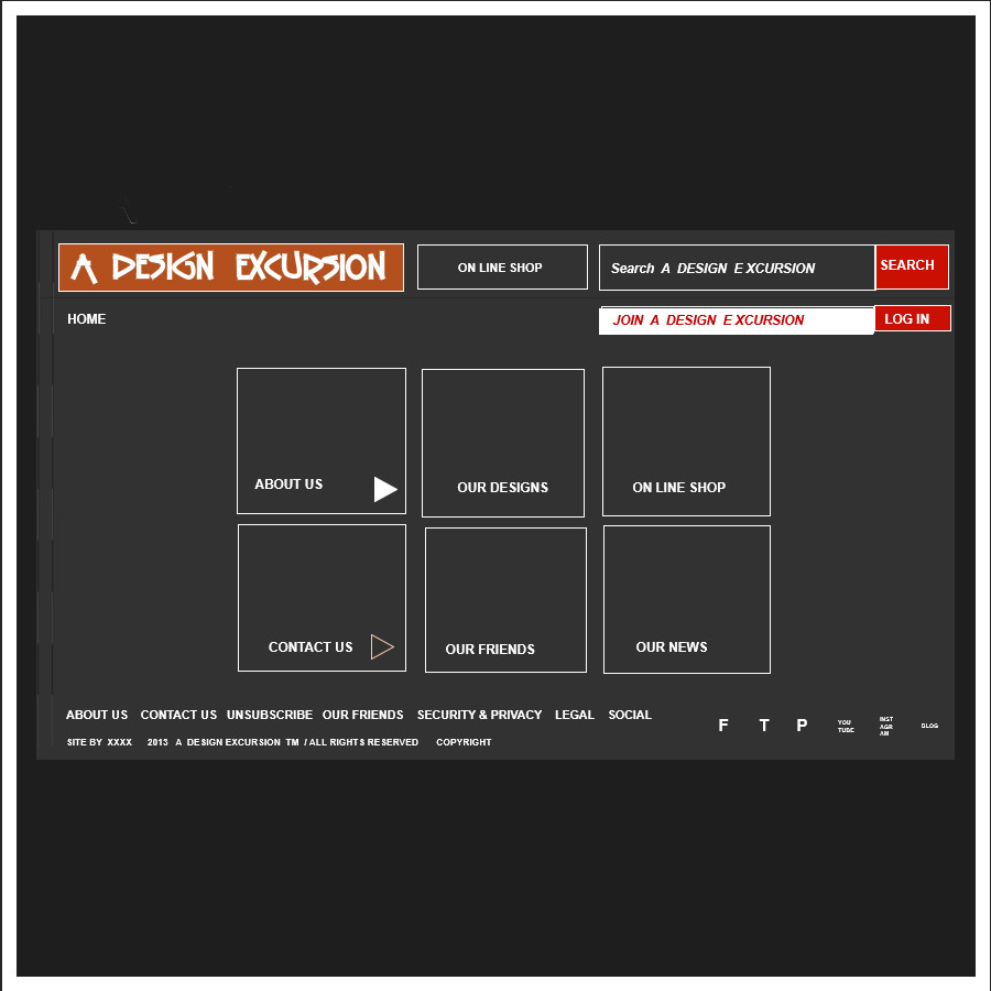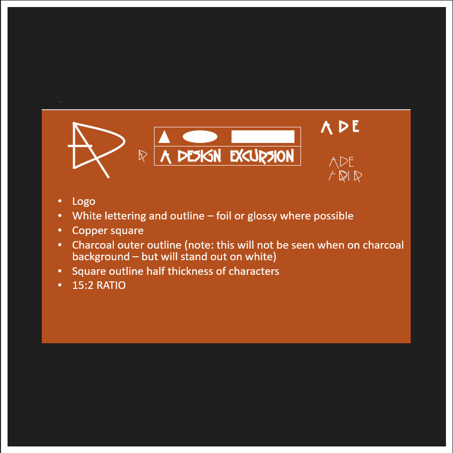
We used our corporate colours and initials of the first letters to create our logo, and continued to use the lettering developed from this for our printing.
See how the logo evolved below

is to link experienced Australian Designers and Fine Artists with Australian Manufactures and Craftsmen to create products which enable the new owner to indulge in
A UNIQUE DESIGN EXCURSION.

We used our corporate colours and initials of the first letters to create our logo, and continued to use the lettering developed from this for our printing.
See how the logo evolved below

The physical image of A DESIGN EXCURSION
Colours - charcoal grey, copper orange, white
Textures- matt grey, glowing copper, shiny white

Shapes - square shapes
Organisation of shapes - in line, ordered, grids
All black, white and grey, except for the logo and the product.
See below how the brand evolved.

We encourage discussion about design
from concept, development, creation and the final use and response of each product.
Encouraging craftsmanship and exploring handmade.

It took a few years to develop the current graphic concept for A DESIGN EXCURSION. The idea from the start was to package hand made Australian creations in a special box.
'PHLOX BOX' - Looking at all the words that rhymed with ‘box” we thought that “Phlox” would be appropriate. It is a flower. It is a pretty magenta colour which would stand out.
Once we researched other people using the name we found that it would not be appropriate - High Technology products, flower companies, and educational services were using the name. Research also showed that the magenta colour also did not appeal to many. The word "phlox" had nothing to do with design!

We then looked at the companies business plan, and what it was to represent. 'Design' was obvious, and a ‘pathway’, ‘discovery’, ‘journey’ were also discussed.
An ‘Excursion’ was not being used any where in a design context. There were holiday and school excursions, but these were in keeping with the design discovery theme, and yet could not be confused with design.

Initially, it was to be "MY DESIGN EXCURSION" - a personalised feel with a skin coloured scheme. Using a pale salmon background with a darker orange and white – an harmonious colour scheme.
We then thought that “my”, gave ownership to only one persons excursion. We wanted all to share ideas – from the initial concept to how people felt using the final product.

We then discussed “OUR” DESIGN EXCURSION. This again excluded those not involved. We wanted people to feel that each design could be explored by all.
The colour scheme had developed to a navy patterned background and contrasting deep rust colour.
It was time to go back to basics......

Because of all the input, and evolution over time, it all had become really busy and messy.
‘A’ DESIGN EXCURSION meant that the design was able to be discussed by everyone.
“A” also meant that we would be the top of any alphabetic list!
Then we needed to look at the colours again.

We revisited the original idea of using a skin colour which most people feel comfortable, the dark orange was toned. The textured navy background didn't feel correct with the uncluttered feel we were to achieve – let the products shine!
The best ‘nothing’ colour is GREY!
This allowed the white to glow, and the skin colour to have a higher chroma and become a copper colour.
These elements allowed us contrast of texture, value, and feeling.

By this stage we had started to research Australian made environmentally friendly packaging products. Back to the box concept, we found Craftpak who had the perfect product!
We explored different colours to find a corporate colour that worked.

Once we started to put the logo in different situations, the length of it did not suit certain situations. We wanted to keep the words. So we played with the 'A' - changing it to incorporate the 'ADE.'
Thus we ended with what we have now, and yet this gives us movement to evolve as we and the world evolve.
We applied to register our trademark on 12 October 2015.
After being processed it was finally registered on 18th May 2016!